Venturing into the world of Facebook advertising.

By Rebecca (PayforPrecision) : Forum Moderator
Published 30th July 2015 | Last comment 24th September 2015
Comments

Like it, too much text, so needs simplifying, but the concept is spot on 

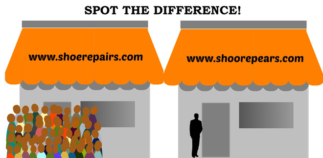
Maybe 2 shops side by side, one with a queue of people, one without, the typo website name on the top of the shop, next to the right one.

Then you can add a smart call to action in the actual description. Remember you can have text in your advert, just minimal text in the actual image. Look at the fiverr one above, only has 1 word in it.


Steve Richardson
Gaffer of My Local Services
My Local Services | Me on LinkedIn

Getting there....still a bit too much text though, according to the grid tool.


Love it.

"Spot the difference" could be in your post, (advert text area) so not actually in the image.

Make the URL's shorter? maybe just shoes.com versus shoos.com

I think it makes the word and typo more obvious. But maybe just me. Can I charge a consultancy fee? 


Steve Richardson
Gaffer of My Local Services
My Local Services | Me on LinkedIn

This Thread is now closed for comments