Infographics, the ability to convey a message or useful information visually. They have been and arguably still are a very effective form of marketing.
But where once upon a time you would see a clear and concise well crafted and useful infographic, where you could quickly absorb the information and pass on credit if you deemed it worthwhile, we now seemed to be bombarded with them, particularly more and more complex ones.
Visit any Social Media platform, especially community style groups, and you will witness a sea of infographics of all shapes and sizes, and every colour of the rainbow. Some are fantastic pieces of crafted content (unlike my magnificent example ).
But a lot of others seem to have missed the original concept, and want to cram as much text and information onto the image as possible, making them unreadable, and normally having to zoom in to try and make out what the text says.
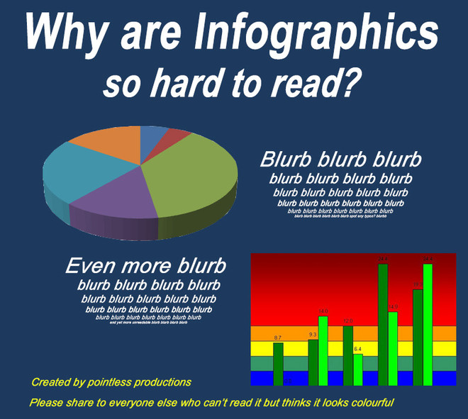
If I have to work hard at reading your content, it had better be good, and this doesn't seem to be the case. Re-churned top 10's and how to write great content, or SEO 101's from yesteryear.
I think infographics still have an important place in your marketing mix, but lets keep the visual message shorter, punchy and readable.
Sometimes I wonder if some businesses think they have to be seen to be creating complex infographics looking at sharing and social media signals, such as likes and Google +1's. But how much of this sharing is quick impulse pretty picture +1's, or share onto my wall as it makes me look interesting as opposed to an audience absorbing and digesting your message and giving you feedback. Most comments tend to be "awesome graphic" or "great info" rather than "good analysis, but how did you get the data for point 3".
Be interesting to see some analysis on conversion rates or targeted traffic coming from infographics other than being used as social media follower bait  Maybe an excuse for a future graphic!
What does anyone else think? Anyone had any experience with using infographics, good or bad?